
Explanation:
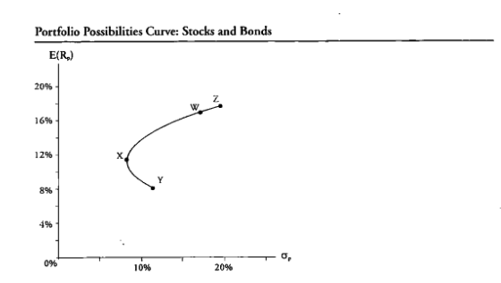
A portfolio possibilities curve (or efficient frontier) shows all possible combinations of two assets—in this case, stocks and bonds—and their associated risk and return.
Moving from Y to Z increases the allocation to stocks.
Higher stock weights push portfolios closer to Z.
A small bond allocation shifts the point slightly inward—exactly where W lies.
No comments yet.
The graph shows the portfolio possibilities curve for stocks and bonds. The point on the graph that most likely represents a 90% allocation in stocks and a 10% allocation in bonds is Portfolio:
A
W
B
X
C
Y
D
Z